Wikipedia:Huge message boxes
Appearance
| This page is intended as humor. It is not, has never been, nor will ever be, a Wikipedia policy or guideline. Rather, it illustrates standards or conduct that are generally not accepted by the Wikipedia community. |


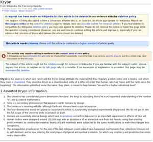
The term huge message boxes or huge templates is a Wikipedia policy regarding the minimum and average size of templates, when used for display on a page as message boxes. The general idea is that these message box templates should be successful in their primary goal — to be seen — and that by being seen they should effectively distract, confuse, and ultimately shut down the article's development, wikistressing-out our end readers and editors.
The general rules (in no particular order):
- Templates must be HUGE — this means that templates must be so enormous that they cannot possibly be ignored or missed, even by people across the room, and especially by those who have seen them before and already know their contents.
- Assume no prerequisite knowledge. Any basic common sense or otherwise irrelevant information should be included (see, e.g., Learn how and when to remove this template message) and done so in the most unordered way — such as to make the average template or message box an object of literature in it own right, competing with the article not only for attention, but for the right to be featured on the front page.
- Templates must be formatted using the {{ambox}} meta-template, which causes them to fit squarely over the text of an article, whereby the article is squashed like a ton of bricks underneath it, optically speaking.
- Templates should be left aligned to match the article text, and skew the page in a leftward direction. Remember: message boxes are by nature good design, so nothing should be considered excessive.
- Stack lots of huge templates together if possible, such that the reader must scroll down a ways to see the article's first paragraph. Project Gutenberg's standard six-and-a-half page header disclaimer section (or "indicia") is what we're going for. This may also require compound templates, and may offer a solution for writing complex articles as well.
- If the templates are small, use twice as many. You cannot have too much of a good thing.
- Navigational boxes must be hierarchical (multi-level, or recursive). If templates are capable of such ingenious presentation, then such functionality must be used to the fullest extent. This is a perfect example.
See also
[edit]- Template:Toomanyboxes
- Wikipedia:Avoid template creep – A less humorous take on the issue
